The do’s and don’ts for exhibitors at an exhibition hall
Last year, Neurofied was present at the Dutch eCommerce exhibition Webwinkel Vakdagen 2018. This exhibition is the biggest meeting place for supply and demand in the world of webshops. My mission was to wander around, observe and see how companies apply neuromarketing in the design of their stands. This may sound relaxing, but an exhibition is one big accumulation of color, sounds and people that try to sell their product. The key to success is to be different from everyone else, to stand out from the crowd. How? I will briefly discuss my experience and give you the do’s and don’ts.
We are not robots
Let’s start with the question what neuromarketing can do for you and your stand on an exhibition in the first place. Neuroscience is making its way into marketing and a growing number of companies are interested in how the brain works. In line with this, a recent study looked at the main aspects of customer experience at an exhibition hall. They measured brain activity, skin conductance and eye movement. The main aspect of these measurements is that they tell us something about unconscious, emotional reactions that are not visible with the naked eye. We humans are not robots, but emotional beings that sense the environment around us. Their conclusion was that sensory enrichment – smell, color, music, lights – enhance the involvement of the visitors, but this is dependent on the context of the exhibition. This means that a food exhibition will have more advantage of the nice smells than a furniture exhibition. Let’s be honest, don’t you also prefer the smell of freshly baked cookies over the smell of furniture wax?
As a company, applying the right sensory enrichment at an exhibition can lead to three things:
- positive overall observations leading to less frustration and more willingness to interact. Visitors will be easier to approach and interested in your stand;
- more intense experiences that directly impact arousal and the willingness to do business at the exhibition;
- better memories that make your brand or product more familiar. Research proves a positive link between this brand familiarity and purchase intention.
This shows that the improvement of human comfort and their sensory experience is fundamental to every exhibition, especially because it can be a very stressful and overwhelming environment.
Do’s and don’ts
Good! Now that I’ve explained something about neuromarketing and exhibition halls, it is time for my own experience. After my observation, there were quite some aspects that did and did not draw my attention. I will briefly sum them up and give some examples.
Color
Because this fair did not hold any food- perfume- or music- related stands, the visual experience is probably the main target for companies to focus on at the WWV. One of the biggest elements of human visual experience is color. Choosing the right colors can have enormous effects on the overall experience of your stand. So which ones are right and which are ‘wrong’?
- do use a color that stands out: an original, fresh color that no one else uses can draw immediate attention of the visitors;
- do use a color that suits your brand. If your website, leaflets and business cards are green, don’t paint your stand pink;
- don’t use a color that will disappear in the exhibition hall. My experience with this one was that some companies were a little unfortunate because the overall color of the hall was blue (especially the carpet). Bol had an impressive stand, but faded into the background because of this;
- don’t overdo it, keep it simple. The (sometimes painful) combination of specific colors can create chaos instead of an appealing stand. Use soft, peaceful colors that create an inviting environment. Want to know why less is more? Read about it here.
Movement
Another option to draw the visitor’s attention is by using movement. It doesn’t mean you should be running around your stand! This can be very subtle. One stand that drew my attention did so by decorating their stand with balloons. Floating balloons always move in a subtle way. Another way is to use displays that show a short, attractive company video.
- Do use movement in an interactive way, this makes visitors more involved in your product and leads to a higher chance of interaction. An example I found creative was using a wheel of fortune, inviting visitors to spin it.
- Don’t let it take over your stand. One of the stands belonged to a supply chain company, but the whole stand consisted of one big conveyor belt. It’s good to show off your product, but there should also be room to sit down, have a coffee and connect with prospects.
Emotion
As explained before, taking the emotions of visitors into account can lead to a more successful stand. There are various ways to do this, but the biggest factor is YOU. One big difference I noticed between stands is the attitude of the people that belong to it. Do they make eye contact? Do they smile, or sit behind their computer without showing any interest? You are representing your company, do this in an open, friendly and curious way and visitors will not quickly forget you.
- Do keep it personal: Inviting a visitor for a nice cup of coffee (or a beer if it’s 4 o’clock) can be a good icebreaker for a business conversation. Watermelon offered visitors to create their product (a chatbot) on the spot, together with someone from the stand.
- Don’t fake it until you make it: Most people can tell pretty quickly if someone is sincere or not. In the end, marketing and business are all about convincing someone about your product, but the trick is to do this in a genuine and credible way.
Show me a good stand!
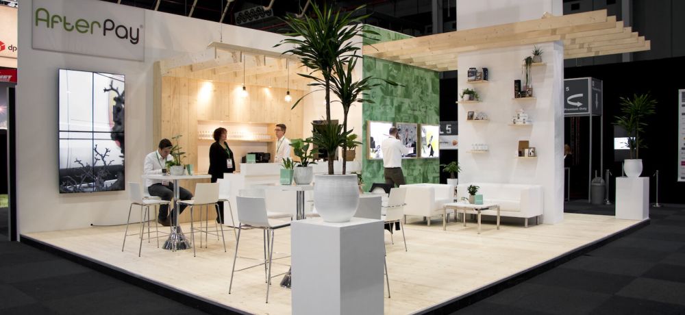
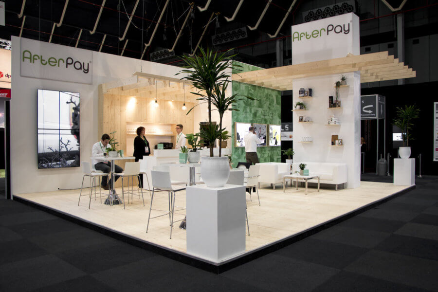
Now that you know a little bit more about the do’s and don’ts at an exhibition, let me show you a company that – in my eyes – nailed it when it comes to sensory experience. This is the stand of AfterPay, a Dutch company that makes it possible to pay for your product after you receive it similar to Klarma.


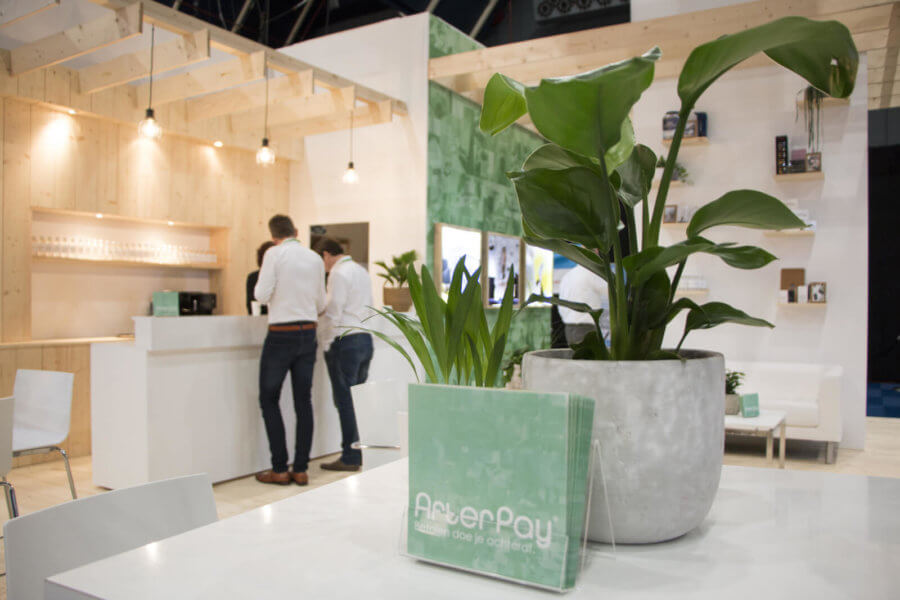
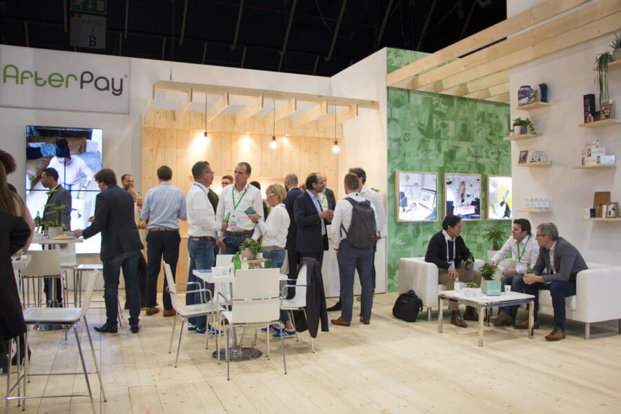
The folks from AfterPay created a very welcoming stand, using an almost ‘feeling like home’ atmosphere. The use of plants, wood and the possibility to sit down made this happen. The stand is open and the use of lights make it a bright environment. Their company color – a fresh kind of green – is present, but not in such an overwhelming way that it overpowers the overall look. They added movement by using a monitor that displays fragments of their product. Also, they display existing customers in a creative way by putting their products on shelves. During the exhibition, I saw a lot of visitors dropping by, sitting down and having a chat. This shows that their stand was an inviting success. Well done AfterPay!
We hope this article gives you some insight into how to create your own, inviting stand. Being at an exhibition means putting yourself out there, standing out from the crowd and making sure the visitors will still think of you after the exhibition.
If you want to learn more about behavioral insights, read our blog or watch 100+ videos on our YouTube channel!
About Neurofied
Neurofied is a behavioral science company specialized in training, consulting, and change management. We help organizations drive evidence-based and human-centric change with insights and interventions from behavioral psychology and neuroscience. Consider us your behavioral business partner who helps you build behavioral change capabilities internally.
Since 2018, we have trained thousands of professionals and worked with over 100 management, HR, growth, and innovation teams of organizations such as Johnson & Johnson, KPMG, Deloitte, Novo Nordisk, ABN AMRO, and the Dutch government. We are also frequent speakers at universities and conferences.
Our mission is to democratize the value of behavioral science for teams and organizations. If you see any opportunities to collaborate, please contact us here.